加工なし CSS のみで画像にグリッチと RGB ずらし効果をかける


はじめに
以下のツイートが500いいねを超えましたので解説記事を書きます。
デモ&ソースコード
CodePen に完成品のデモとソースコードを置いてあります。
グリッチとは
元々は「一過性の障害」という意味ですが、映像の世界ではしばしば「映像の乱れ」という意味で用いられます。ホラーやサイバーなどでよく見られる演出の一つ。
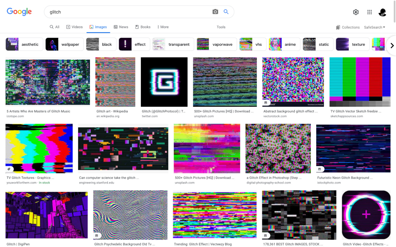
https://www.google.com/search?q=glitch&tbm=isch
RGB ずらしとは
色収差、RGB シフト、RGB split (RGB 分割) など、さまざまな言い方がありますが、要するに本来光の三原色である Red、Green、Blue がズレることなく重なって映像を映し出すところ、それがズレた状態で表示されることです。
グリッチエフェクトと一緒に用いたり、場合によっては色ズレも含めてグリッチと言ったりしますので、今回も合わせて実装することでよりグリッチ感が出ると思います。
実装
コンテナ要素
<div class="glitch" style="background-image: url(...);">
</div>
要素のインラインスタイルでグリッチ効果をかけたい画像を background-image として指定します。
.glitch {
  background: #000 no-repeat center;
  background-size: 0; // `.glitch` 自体には背景画像を表示しないようにする
  height: 100vh; // width や height は自由
  overflow: hidden;
  position: relative;
}
CSS はこんな感じ。ポイントは background-size: 0; で .glitch 要素自体には画像を表示させません。
画像を RBG に分割
 <div class="glitch" style="background-image: url(...);">
+  <div class="channel r"></div>
 </div>
試しに Red チャンネルのみを表示させてみます。
 .glitch {
   ...
+  .channel {
+    background: inherit; // コンテナ要素の背景を継承
+    background-size: cover;
+    bottom: 0;
+    left: 0;
+    position: absolute;
+    right: 0;
+    top: 0;
+  }
+
+  // あとの実装のため上記 `.channel` と分けて記述
+  .channel {
+    &::before {
+      bottom: 0;
+      content: "";
+      display: block;
+      left: 0;
+      mix-blend-mode: multiply; // 画像に R/G/B を乗算で重ねるとそれぞれのチャンネルを作ることができる
+      position: absolute;
+      right: 0;
+      top: 0;
+    }
+  }
+
+  .r {
+    &::before {
+      background: #f00;
+    }
+  }
}
これで Red チャンネルが表示されるはず。
 <div class="glitch" style="background-image: url(...);">
   <div class="channel r"></div>
+  <div class="channel g"></div>
+  <div class="channel b"></div>
 </div>
同様に Green、Blue チャンネルを追加。
 .glitch {
   ...

   .channel {
     ...
   }

   .channel {
+    mix-blend-mode: screen; // 各チャンネルをスクリーンで重ねると元の画像に合成することができる

     &::before {
       ...
     }
   }

   .r {
     ...
   }

+  .g {
+    &::before {
+      background: #0f0;
+    }
+  }
+
+  .b {
+    &::before {
+      background: #00f;
+    }
+  }
RGB チャンネルをそれぞれ作ってスクリーンで重ねると元の画像が表示されます。
この状態でチャンネルを translate() で適当に動かしてみると、RGB ずらしの効果を得られます。
   .r {
+    transform: translate(4px, 2px);
     ...
   }

   .g {
+    transform: translate(-3px, -1px);
     ...
   }

RGB ずらしのアニメーション
@function rand($min, $max) {
  @return random() * ($max - $min) + $min;
}
最大値と最小値を簡単に設定できるランダム関数を作っておきます。
$animation-duration: 3s; // 何秒おきにアニメーションをループするか
$glitch-duration: 20%; // グリッチ (RGB ずらし) 自体の長さ、上記秒数に対するパーセンテージ
$glitch-frequency: 10; // 動きの頻度
$glitch-interval: $glitch-duration / $glitch-frequency;

@mixin rgb-shift($name) {
  @keyframes rgb-shift-#{$name} {
    @for $i from 0 to $glitch-frequency {
      #{$i * $glitch-interval} {
        transform: translate(
          #{rand(-2, 2) * 1%}, // 左右にどれぐらい動くか (横幅の±2%)
          #{rand(-0.5, 0.5) * 1%} // 上下にどれぐらい動くか (縦幅の±0.5%)
        );
      }
    }

    #{$glitch-duration}, 100% {
      transform: none;
    }
  }

  animation: rgb-shift-#{$name} $animation-duration steps(1, jump-end) infinite alternate both;
}
RGB のそれぞれのチャンネル用に @keyframes の作成と animation の設定を同時に行うミックスインを作っておきます。
ポイントとして、animation-timing-function は steps(n, <jumpterm>) 関数を使うと、滑らかな動きではなく、カクカクした動きになるのでよりグリッチっぽくなります。詳しくは animation-timing-function | MDN 。
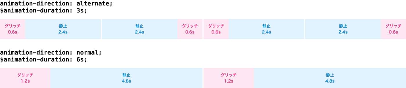
もう一つは animation-direction を alternate にしているところ。これがなくても $animation-duration $glitch-duration $glitch-frequency を調整すれば大丈夫なんですが、上図のように同じ長さのグリッチと静止状態でも、alternate にすると繰り返されるアニメーションの長さは半分で済みます。それによって書き出される CSS コードも半分ぐらいで済みます。
   .r {
-    transform: translate(4px, 2px);
+    @include rgb-shift(r);
     ...
   }

   .g {
-    transform: translate(-3px, -1px);
+    @include rgb-shift(g);
     ...
   }

   .b {
+    @include rgb-shift(b);
     ...
   }
各チャンネルでミックスインをインクルードすれば、RGB ずらしのアニメーションが再生されます。
グリッチ
グリッチをどのように実装するかというと、同じ画像を重ねて一部を切り取ってずらす。
 .glitch {
   ...
+  &::before,
+  &::after,
   .channel {
     background: inherit;
     background-size: cover;
     bottom: 0;
     left: 0;
     position: absolute;
     right: 0;
     top: 0;
   }

+  &::before {
+    content: "";
+  }
+
+  &::after {
+    content: "";
+  }
   ...
 }
疑似要素を使って同じ画像を重ねます (div などでも可) 。
 .glitch {
   ...

   &::before {
+    clip-path: polygon(
+      0 20%,
+      100% 20%,
+      100% 30%,
+      0 30%
+    );
+    transform: translate(5%, 0.5%);
     content: "";
   }

   &::after {
+    clip-path: polygon(
+      0 60%,
+      100% 60%,
+      100% 65%,
+      0 65%
+    );
+    transform: translate(-5%, -0.5%);
     content: "";
   }
   ...
 }
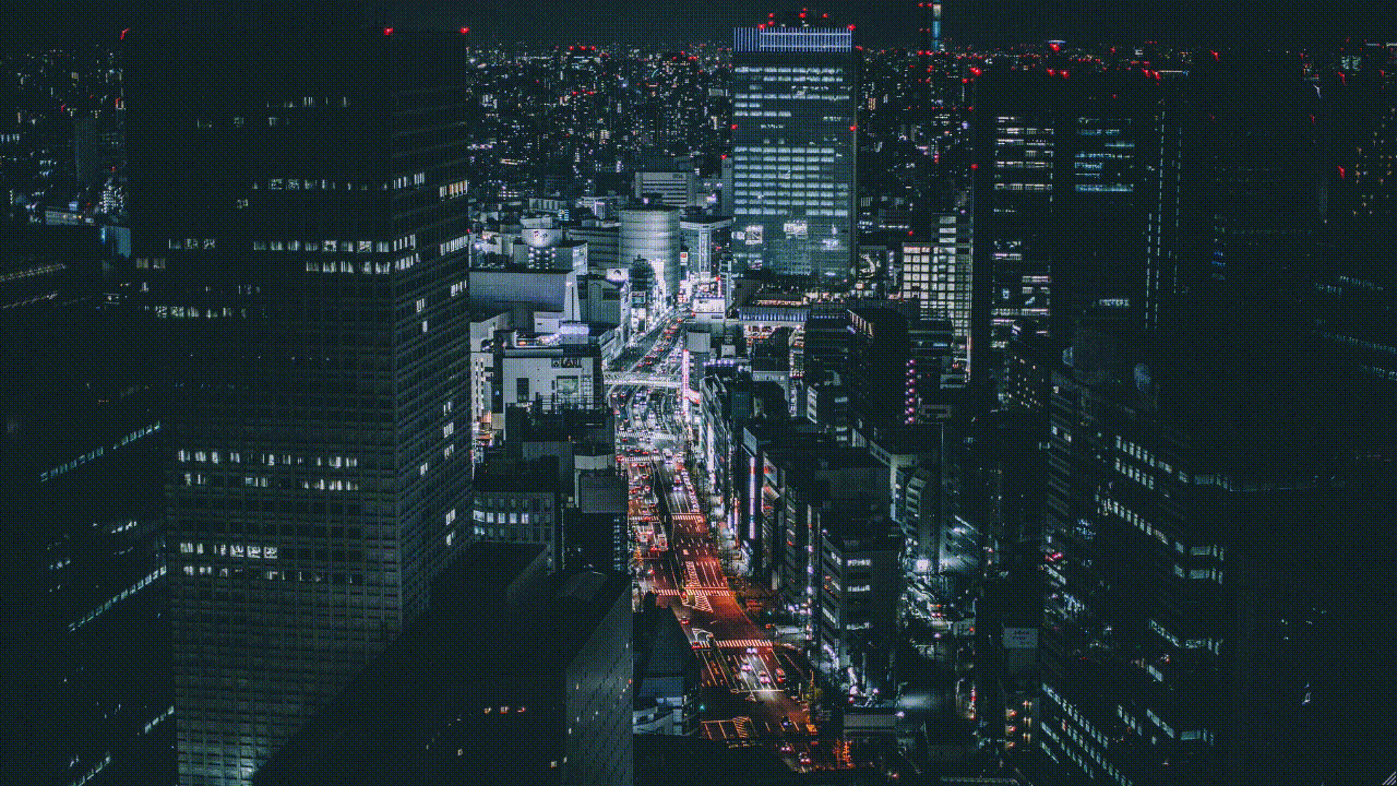
試しに静止状態のグリッチを表示してみます。画像の切り抜きは clip-path() を使います。詳細は clip-path | MDN 。
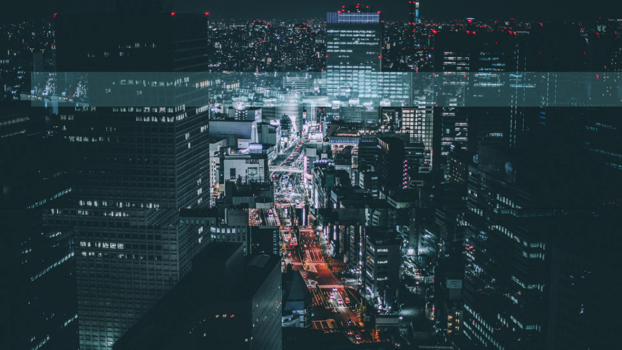
before のほうは、RGB レイヤーより下にあり、さらに RGB レイヤーは mix-blend-mode: sreen; になっているため、その部分だけが明るくなり、けっこうグリッチっぽいと思います。
after のほうは少しわかりにくいんですが、真ん中より少し下に画像の一部だけが少しズレています。
2つだけですが、激しく動かしたりサイズを変えたりして、RGB ずらしと組み合わせるとかなりグリッチっぽくなります。もちろん div などを使えばもっと増やすことも可能です。
グリッチアニメーション
@mixin glitch($name) {
  @keyframes glitch-#{$name} {
    @for $i from 0 to $glitch-frequency {
      $left: 0%;
      $right: 100%;
      $top: rand(0, 90) * 1%; // 切り取る位置 (縦軸0%〜90%内でランダムに動かす)
      $bottom: $top + rand(1, 10) * 1%; // 切り取るサイズ (画像縦幅1%〜10%)

      #{$i * $glitch-interval} {
        clip-path: polygon(
          $left $top,
          $right $top,
          $right $bottom,
          $left $bottom
        );
        transform: translate(
          #{rand(-8, 8) * 1%}, // 左右にどれぐらい動くか (横幅の±8%)
          #{rand(-0.5, 0.5) * 1%} // 上下にどれぐらい動くか (縦幅の±0.5%)
        );
      }
    }

    #{$glitch-duration}, 100% {
      clip-path: none;
      transform: none;
    }
  }

  animation: glitch-#{$name} $animation-duration linear infinite alternate both;
}
RGB ずらし同様、ミックスインを作っておきます。
 .glitch {
   ...

   &::before {
+    @include glitch(before);
-    clip-path: polygon(
-      0 20%,
-      100% 20%,
-      100% 30%,
-      0 30%
-    );
-    transform: translate(5%, 0.5%);
     content: "";
   }

   &::after {
+    @include glitch(after);
-    clip-path: polygon(
-      0 60%,
-      100% 60%,
-      100% 65%,
-      0 65%
-    );
-    transform: translate(-5%, -0.5%);
     content: "";
   }
   ...
 }
あとはこれを疑似要素にインクルードすれば完成です。
おわりに
デモのように無限ループでアニメーションさせると閲覧者を気分悪くさせる可能性があるので、用法用量を考えたほうがいいとは思います。ただ、CSS でグリッチ・RGB ずらし効果をかけられるということは、簡単にマウスホバーの効果として利用できるということなので、演出の一つとしてわりとありかもしれません。
宣伝
腕に自信があるフロントエンドエンジニア、デザイナー、ディレクター、もしご興味ございましたら覗いてみてください。
ソースコード全体
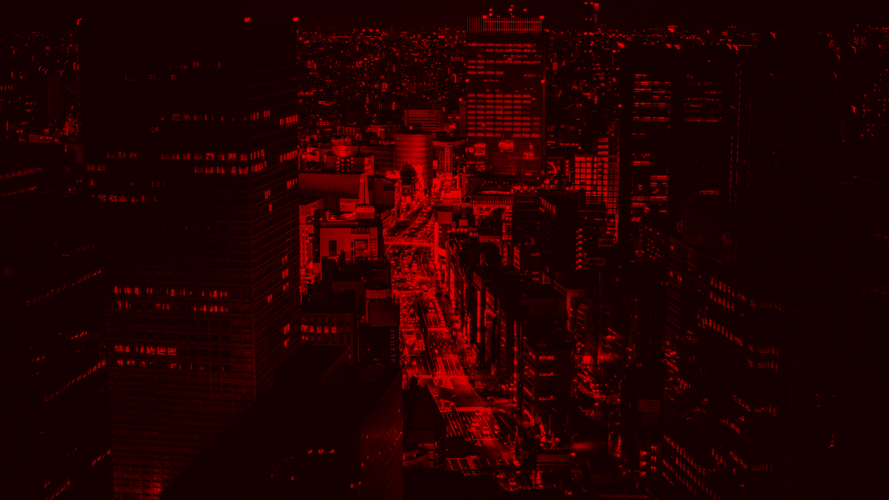
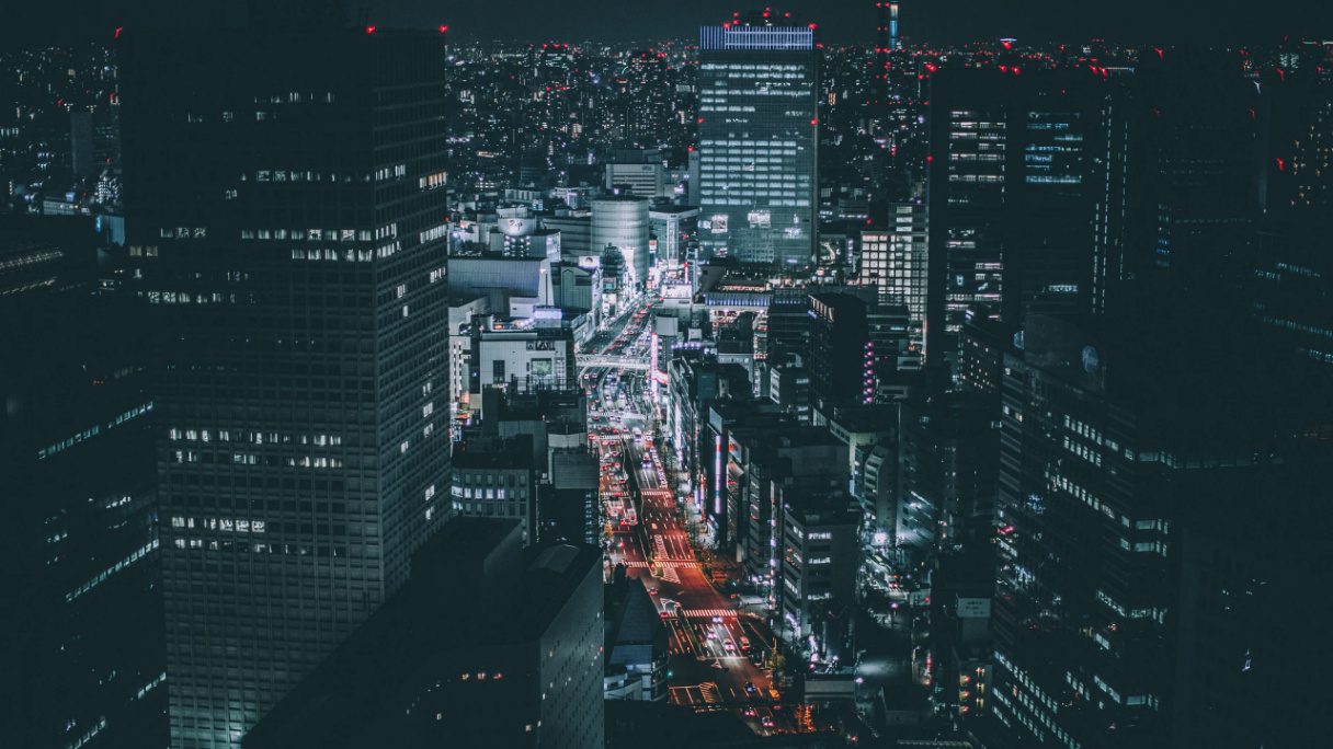
<div class="glitch" style="background-image: url(https://images.unsplash.com/photo-1493514789931-586cb221d7a7?ixlib=rb-1.2.1&ixid=MXwxMjA3fDB8MHxwaG90by1wYWdlfHx8fGVufDB8fHw%3D&auto=format&fit=crop&w=1920&q=80);">
  <div class="channel r"></div>
  <div class="channel g"></div>
  <div class="channel b"></div>
</div>
@function rand($min, $max) {
  @return random() * ($max - $min) + $min;
}

$animation-duration: 3s;
$glitch-duration: 20%;
$glitch-frequency: 10;
$glitch-interval: $glitch-duration / $glitch-frequency;

@mixin rgb-shift($name) {
  @keyframes rgb-shift-#{$name} {
    @for $i from 0 to $glitch-frequency {
      #{$i * $glitch-interval} {
        transform: translate(
          #{rand(-2, 2) * 1%},
          #{rand(-0.5, 0.5) * 1%}
        );
      }
    }

    #{$glitch-duration}, 100% {
      transform: none;
    }
  }

  animation: rgb-shift-#{$name} $animation-duration steps(1, jump-end) infinite alternate both;
}

@mixin glitch($name) {
  @keyframes glitch-#{$name} {
    @for $i from 0 to $glitch-frequency {
      $left: 0%;
      $right: 100%;
      $top: rand(0, 90) * 1%;
      $bottom: $top + rand(1, 10) * 1%;

      #{$i * $glitch-interval} {
        clip-path: polygon(
          $left $top,
          $right $top,
          $right $bottom,
          $left $bottom
        );
        transform: translate(
          #{rand(-8, 8) * 1%},
          #{rand(-0.5, 0.5) * 1%}
        );
      }
    }

    #{$glitch-duration}, 100% {
      clip-path: none;
      transform: none;
    }
  }

  animation: glitch-#{$name} $animation-duration linear infinite alternate both;
}

body {
  margin: 0;
}

.glitch {
  background: #000 no-repeat center;
  background-size: 0;
  height: 100vh;
  position: relative;
  overflow: hidden;

  &::before,
  &::after,
  .channel {
    background: inherit;
    background-size: cover;
    bottom: 0;
    left: 0;
    position: absolute;
    right: 0;
    top: 0;
  }

  &::before {
    @include glitch(before);
    content: "";
  }

  &::after {
    @include glitch(after);
    content: "";
  }

  .channel {
    mix-blend-mode: screen;

    &::before {
      bottom: 0;
      content: "";
      display: block;
      mix-blend-mode: multiply;
      position: absolute;
      left: 0;
      right: 0;
      top: 0;
    }
  }

  .r {
    @include rgb-shift(r);

    &::before {
      background: #f00;
    }
  }

  .g {
    @include rgb-shift(g);

    &::before {
      background: #0f0;
    }
  }

  .b {
    @include rgb-shift(b);

    &::before {
      background: #00f;
    }
  }
}
Discussion