ペルソナ5 の UI かっこいいですよね。
今は ペルソナ5S が出ていますが、今回は ペルソナ5 のメッセージウィンドウを、
もしかしたら CSS で作れるんじゃないか、と思って作ってみました。
画像としてはこんな感じ
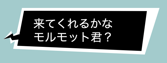
これがゆらゆらアニメーションします。
特徴
- 自由変形した四角形。
- 白と黒で重なったウィンドウ
- 吹き出しの矢印の部分の複雑な形
- 不規則にそれぞれの枠が別々で動くアニメーション
動作サンプル( Codepen )
See the Pen Persona5 Message Window by ばりとん📛フルスタックエンジニア兼ITコンサル (@dd0125) on CodePen.
ソースコード
persona5.html
<link rel="stylesheet" href="persona5.css">

<body>
<h1>ペルソナ5 メッセージウィンドウ</h1>

<div class="message-window">

  <div class="message-area">
        <div class="content">
            <div class="arrow-white">
            </div>
            <div class="arrow-black">
            </div>

            <div class="background-white">
            </div>
            <div class="background-black">
            </div>
            <div class="text-area">
                <div>来てくれるかな</div>
                <div>モルモット君?</div>
            </div>
        </div>
    </div>
</div>
</body>


<style>

    body {
        background-color: #9cc;
    }
</style>
persona5.scss
.message-window {
  width: 300px;
  position: relative;

  .message-area {
    position: absolute;
    left: 20px;

    > .content {
      position: relative;

      .arrow-white {
        background-color: #fff;
        position: absolute;
        width: 25px;
        height: 25px;
        bottom: 20px;
        left: -17px;
        z-index: -20;

        clip-path: polygon(62% 43%, 100% 17%, 100% 73%, 50% 100%, 44% 56%, 0 71%, 55% 8%);
        animation-name: arrowWhiteAnimation;
        animation-duration: 1s;
        animation-iteration-count: infinite;

      }

      .arrow-black {
        background-color: #000;
        position: absolute;
        width: 28px;
        height: 20px;
        bottom: 22px;
        left: -17px;

        z-index: -10;

        clip-path: polygon(62% 43%, 100% 26%, 100% 73%, 53% 80%, 44% 56%, 0 71%, 56% 19%);

        animation-name: arrowBlackAnimation;
        animation-duration: 1s;
        animation-iteration-count: infinite;
      }

      .background-white {
        background-color: #fff;
        position: absolute;
        width: 100%;
        height: 100%;
        z-index: -40;

        clip-path: polygon(6% 0, 100% 0, 90% 100%, 0 87%);

        animation-name: backgroundWhiteAnimation;
        animation-duration: 1s;
        animation-iteration-count: infinite;
      }

      .background-black {
        background-color: #000;
        position: absolute;

        width: calc(100% - 25px);
        height: calc(100% - 12px);
        margin-left: 5px;
        margin-right: 20px;
        margin-top: 5px;
        margin-bottom: 7px;

        z-index: -30;

        clip-path: polygon(6% 0, 100% 0, 95% 100%, 0 87%);

        animation-name: backgroundBlackAnimation;
        animation-duration: 1s;
        animation-iteration-count: infinite;

      }
      .text-area {
        color: #fff;
        font-size: 20px;
        margin-left: 5px;
        margin-right: 50px;
        margin-top: 5px;
        margin-bottom: 7px;

        padding-left: 30px;
        padding-right: 30px;
        padding-top: 15px;
        padding-bottom: 20px;

        line-height: 1.2em;

      }

    }

  }
  @keyframes arrowWhiteAnimation {
    0% {
      clip-path: polygon(62% 43%, 100% 17%, 100% 73%, 50% 100%, 44% 56%, 0 71%, 55% 8%);
    }
    25% {
      clip-path: polygon(62% 43%, 100% 18%, 99% 73%, 50% 99%, 44% 56%, 0 72%, 55% 8%);
    }
    50% {
      clip-path: polygon(61% 43%, 98% 17%, 100% 73%, 48% 100%, 43% 56%, 1% 71%, 56% 8%);
    }
    75% {
      clip-path: polygon(62% 44%, 100% 17%, 100% 72%, 50% 100%, 44% 58%, 0 71%, 55% 9%);
    }
    100% {
      clip-path: polygon(62% 43%, 100% 17%, 100% 73%, 50% 100%, 44% 56%, 0 71%, 55% 8%);
    }
  }
  @keyframes arrowBlackAnimation {
    0% {
      clip-path: polygon(62% 43%, 100% 26%, 100% 73%, 53% 80%, 44% 56%, 0 71%, 56% 19%);
    }
    25% {
      clip-path: polygon(63% 43%, 100% 26%, 98% 73%, 53% 80%, 42% 56%, 1% 71%, 56% 19%);
    }
    50% {
      clip-path: polygon(62% 44%, 100% 27%, 100% 72%, 53% 81%, 44% 57%, 0 74%, 56% 18%);
    }
    75% {
      clip-path: polygon(62% 43%, 99% 26%, 100% 73%, 54% 80%, 44% 56%, 0 71%, 57% 19%);
    }
    100% {
      clip-path: polygon(62% 43%, 100% 26%, 100% 73%, 53% 80%, 44% 56%, 0 71%, 56% 19%);
    }
  }

  @keyframes backgroundWhiteAnimation {
    0% {
      clip-path: polygon(6% 0, 100% 0, 90% 100%, 0 87%);
    }
    25% {
      clip-path: polygon(6% 0, 98% 1%, 90% 100%, 1% 88%);
    }
    50% {
      clip-path: polygon(6% 2%, 100% 0, 89% 100%, 0 87%);
    }
    75% {
      clip-path: polygon(6% 0, 100% 0, 90% 99%, 0 87%);
    }
    100% {
      clip-path: polygon(6% 0, 100% 0, 90% 100%, 0 87%);
    }
  }

  @keyframes backgroundBlackAnimation {
    0% {
      clip-path: polygon(6% 0, 100% 0, 95% 100%, 0 87%);
    }
    25% {
      clip-path: polygon(7% 0, 100% 0, 94% 100%, 0 88%);
    }
    50% {
      clip-path: polygon(6% 1%, 100% 0, 95% 99%, 0 87%);
    }
    75% {
      clip-path: polygon(6% 0, 99% 1%, 95% 100%, 1% 87%);
    }
    100% {
      clip-path: polygon(6% 0, 100% 0, 95% 100%, 0 87%);
    }
  }
}
特に重要なところ
clip-path
clip-path: polygon(6% 0, 100% 0, 95% 100%, 0 87%);
clip-path という css です。
これは任意のエレメントを任意の形で切り取って表示できる仕組みです。
これを使って、大きな四角形の div を不規則な平行四辺形で切り取っています。
更にこれは CSSアニメーションに対応しています。
clip-path を手で作るのは複雑なので、以下のサイトを使うと便利です。
css clip-path maker
https://bennettfeely.com/clippy/
KeyframeAnimation
@keyframes backgroundBlackAnimation {
  0% {
    clip-path: polygon(6% 0, 100% 0, 95% 100%, 0 87%);
  }
  25% {
    clip-path: polygon(7% 0, 100% 0, 94% 100%, 0 88%);
  }
  50% {
    clip-path: polygon(6% 1%, 100% 0, 95% 99%, 0 87%);
  }
  75% {
    clip-path: polygon(6% 0, 99% 1%, 95% 100%, 1% 87%);
  }
  100% {
    clip-path: polygon(6% 0, 100% 0, 95% 100%, 0 87%);
  }
}
これを使うことで、複雑なアニメーションを定義できます。
今回は clip-path の値を少しずつずらして、 0% と 100% の時に元に戻るようにしました。
そして div に以下のように KeyframeAnimation を利用するように記述します。
animation-name: backgroundBlackAnimation;
animation-duration: 1s;
animation-iteration-count: infinite;
すると、1秒を使ってアニメーションを行う。アニメーションの回数は永遠という指定をしています。
これでゆらゆらずっと動き続けるようになります。