Thin Fonts Are a Usability Nightmare
CRANK
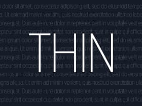
Thin fonts may look sleek, but they’re a usability nightmare—hard to read, inaccessible, and especially frustrating on mobile. Thankfully, some brands and websites are finally ditching them in favor of thicker, more readable typography that actually puts users first.