今回やること
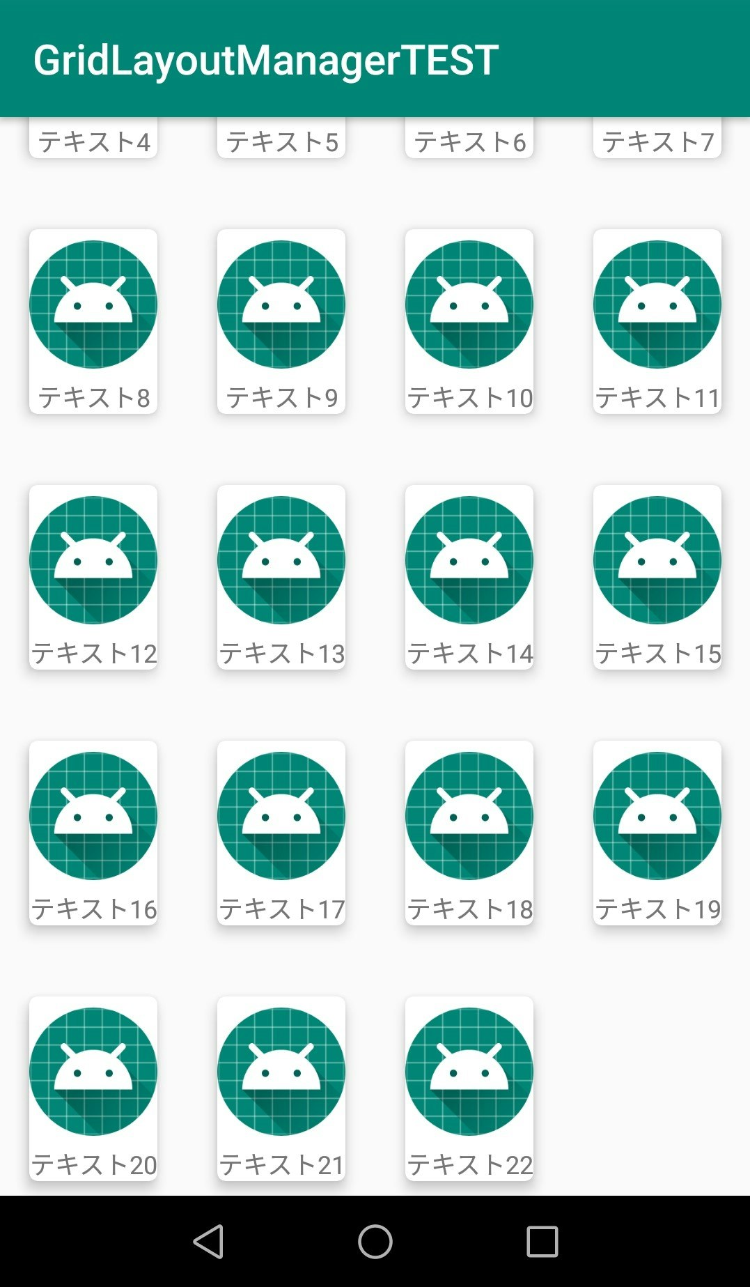
RecyclerViewでgridLayout、tableLayoutっぽく表示する。あとcardViewを使ってUIを手っ取り早く、それっぽくする
これ↓
RecyclerViewの配置
レイアウトファイルにRecyclerViewを配置する
<androidx.constraintlayout.widget.ConstraintLayout xmlns:android="http://schemas.android.com/apk/res/android"
    xmlns:app="http://schemas.android.com/apk/res-auto"
    xmlns:tools="http://schemas.android.com/tools"
    android:layout_width="match_parent"
    android:layout_height="match_parent"
    tools:context=".MainActivity">

    <androidx.recyclerview.widget.RecyclerView
        android:id="@+id/gridRecyclerView"
        android:layout_width="0dp"
        android:layout_height="0dp"
        app:layout_constraintBottom_toBottomOf="parent"
        app:layout_constraintEnd_toEndOf="parent"
        app:layout_constraintStart_toStartOf="parent"
        app:layout_constraintTop_toTopOf="parent" />
</androidx.constraintlayout.widget.ConstraintLayout>
RecyclerViewの中身
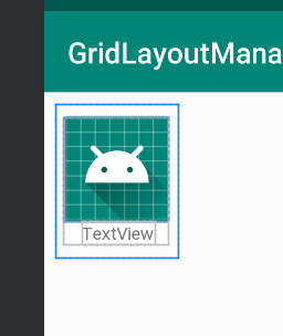
CardViewの中に画像とテキストを入れたレイアウトを作成する
CardViewはelevationとRadiusを5dpくらいつけとけば手軽にそれっぽくなる
<androidx.constraintlayout.widget.ConstraintLayout xmlns:android="http://schemas.android.com/apk/res/android"
    xmlns:app="http://schemas.android.com/apk/res-auto"
    xmlns:tools="http://schemas.android.com/tools"
    android:id="@+id/constrainLayout"
    android:layout_width="wrap_content"
    android:layout_height="wrap_content"
    android:layout_margin="8dp"
    android:orientation="vertical">

    <androidx.cardview.widget.CardView
        android:layout_width="match_parent"
        android:layout_height="wrap_content"
        app:cardCornerRadius="4dp"
        app:cardElevation="5dp"
        app:cardUseCompatPadding="true"
        app:layout_constraintBottom_toBottomOf="parent"
        app:layout_constraintEnd_toEndOf="parent"
        app:layout_constraintStart_toStartOf="parent"
        app:layout_constraintTop_toTopOf="parent">

        <androidx.constraintlayout.widget.ConstraintLayout
            android:layout_width="match_parent"
            android:layout_height="match_parent">

            <ImageView
                android:id="@+id/imageView"
                android:layout_width="wrap_content"
                android:layout_height="wrap_content"
                android:scaleType="fitCenter"
                app:layout_constraintEnd_toEndOf="parent"
                app:layout_constraintStart_toStartOf="parent"
                app:layout_constraintTop_toTopOf="parent"
                app:srcCompat="@mipmap/ic_launcher_round" />

            <TextView
                android:id="@+id/textView"
                android:layout_width="wrap_content"
                android:layout_height="wrap_content"
                android:text="TextView"
                android:textSize="12sp"
                app:layout_constraintBottom_toBottomOf="parent"
                app:layout_constraintEnd_toEndOf="@+id/imageView"
                app:layout_constraintStart_toStartOf="@+id/imageView"
                app:layout_constraintTop_toBottomOf="@+id/imageView" />
        </androidx.constraintlayout.widget.ConstraintLayout>

    </androidx.cardview.widget.CardView>

</androidx.constraintlayout.widget.ConstraintLayout>
アダプターをつくる
RecyclerView用のアダプターをRecyclerView.Adapterを継承して作成する
//// customListはrecyclerViewのコンテンツとしてに表示するString配列のデータ
class CustomAdapter(private val customList: Array<String>) :
    RecyclerView.Adapter<CustomAdapter.CustomViewHolder>() {

    // ViewHolderクラスを作成
    class CustomViewHolder(val view: View) : RecyclerView.ViewHolder(view) {
        val img = view.imageView
        val txt = view.textView
    }

    // getItemCount onCreateViewHolder onBindViewHolderを実装
    // recyclerViewのコンテンツのサイズ
    override fun getItemCount(): Int {
        return customList.size
    }

    // 上記のViewHolderクラスを使ってViewHolderを作成
    override fun onCreateViewHolder(parent: ViewGroup, viewType: Int): CustomViewHolder {
        val layoutInflater = LayoutInflater.from(parent.context)
        val item = layoutInflater.inflate(R.layout.grid_view, parent, false)
        return CustomViewHolder(item)
    }

    // ViewHolderに表示するデータを挿入
    override fun onBindViewHolder(holder: CustomViewHolder, position: Int) {
        holder.view.textView.text = customList[position]
        holder.view.imageView.setImageResource(R.mipmap.ic_launcher_round)
    }
}
アダプターをセットする
表示するデータ配列を作ってアダプターをrecyclerViewにセット
class MainActivity : AppCompatActivity() {

    override fun onCreate(savedInstanceState: Bundle?) {
        super.onCreate(savedInstanceState)
        setContentView(R.layout.activity_main)

        /// 表示するテキスト配列を作る [テキスト1, テキスト2, ....]
        val list = Array<String>(23) {"テキスト$it"}
        val adapter = CustomAdapter(list)
        val layoutManager = GridLayoutManager(this, 4, GridLayoutManager.VERTICAL, false)

        // アダプターとレイアウトマネージャーをセット
        gridRecyclerView.layoutManager = layoutManager
        gridRecyclerView.setHasFixedSize(true)
        gridRecyclerView.adapter = adapter
    }
}
layoutManagerに何を使うかでだいぶ変わってくる。
今回使ったのはGridLayoutManagerだがよく使うのはLinearLayoutManagerでlinearだとrecyclerViewの中身が上から1個ずつ積み重なるよく見かけるあのレイアウトになる。他にはStaggeredGridLayoutManagerとかある。
GridLayoutManager
引数について
GridLayoutManager(コンテキスト, カラム数, GridLayoutのタイプ, 下から要素を埋めていくか?)
「カラム数」は1行に何個表示させるか、GridLayoutのタイプはVERTICALのほかにHORIZONTALとかがありHORIZONTALにすると横に要素が積み重なり、横にスクロールできるようになる。
おわり
CardView使ったら簡単にUIが、それっぽくなるから便利。あとlayoutManagerを変えるだけでどんな風に要素を重ねていくか決めれるのは楽でいいなと改めて思った。
個人的余談だけど Androidでのバックエンド言語に何を使うのがメジャーなのかわからない... SQLiteとかGo MobileとかサーバーだけどAWSとかいろいろあるけど何を使うのが一般的なんだろ?