Big data is often a buzzword. In recent years the big data word has preoccupied business owners and made department managers drool. One crucial prerequisite to big data is to utilize professional data visualization tools. These tools provide a better way to access, explore and communicate your data. Here are the ten best data visualization tools you should know for 2020.
What Is A Data Visualization Software?
Data visualization software provides a visual representation of a company’s data in the form of interactive charts and graphs. The software has extensive analytics and reporting features that enable organizations to explore their data dynamically. Better business decisions will always be made with better input from precise data.
One crucial aspect surrounding data visualization software is the ability to drive action and the most accurate business judgments. You’ll make the best possible decision from the newest — vital — digital environment.
The collection of data is not going to slow down; the increment of information we process daily in our digital age only confirms how data visualization tools are critical. These tools provide succinct, informative, and actionable insights.
What Are The Benefits Of Professional Data Visualization Tools?
Data visualization comes in many forms, from simple Excel charts to PowerPoint graphs. The best focus is on professional software that can be tested through free trials, and data already obtained.
The data focuses on certain popularity in the data via your business community.
These tools provide countless benefits. Here is a brief list of the most notable ones:
-
Interactive data visualization features.
In your business, you’ll want detailed information on:
- Specific products.
- On a specific month.
- For a unique location.
- Visuals for the company’s financial health as a whole.
- Visualize the performance of marketing campaigns.
Professional software enables you to drill-down and perform deeper analysis, just by clicking on a specific part of the visualized chart.
You can zoom-in and apply customized (hierarchical) filters. You’ll have advanced conditional formatting that the software enables you to explore and then choose from diverse options.
-
Real-time updates.
One of the main benefits these tools and software offer is the ability to provide real-time visualizations.
In a business scenario, you’ll want to update new reports. You don’t want to access the datasets and find they are obsolete, closed, or can’t be updated automatically.
On the other hand, the software enables automatic updates of visualizations in real-time. There is no place for assumptions nowadays. Real-time software saves you countless hours of copying and searching for information from spreadsheets.
-
Designed for technical and non-technical users.
Compiling a report or creating a dashboard by pulling hundreds or thousands of numbers from a database is complex. If you’re part of the IT department or the head of a department, these reports are still tedious.
Modern Data visualization software enables both technical and non-technical users to extract, manipulate, and create their own dashboards and reports. Ultimately, data visualization software increases the productivity of the whole company and saves everyone time.
-
Trend analysis and predictive analytics.
Particularly beneficial to the relevant group, department, team, or stakeholder, is predictive analytics. The benefits include enabling users to explore future data without having to focus on visualizing only past data.
Leaving the vague ‘hunches’ behind, professional data visualization tools are usually integrated within Business Intelligence platforms. BI platforms allow you to look into the future, easily drawing conclusions. You’ll spot trends that would, otherwise, stay hidden in endless numbers and datasets.
To help you determine the best possible solutions for your business or department — here’s a list of the top 10 data visualization software and tools to consider for your 2020 business strategy.
What Are The Best Data Visualization Tools On The Market?
datapine
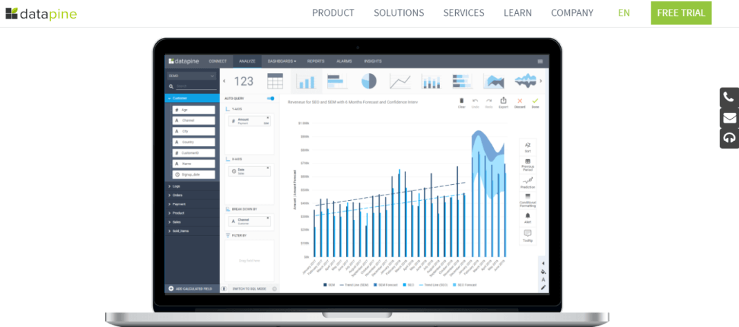
A data visualization software, datapine, enables both technical and non-technical users to take advantage of compelling data. You’ll use features such as predictive analytics. Predictive analytics features enable you to explore your visualizations based on the prediction engine. You select the data points of interest, and the software will calculate the forecast based on your past data.
You can also select the model quality, define the confidence interval (usually 95%), and visually explore future outcomes. You’ll know what to expect because of the comparison with the previous period. Past data will provide you with additional visual details where you’ll directly see how you performed.
Past data compared with current data within the selected data points provides value at any level. Conditional formatting is data via the features that ensure your visualization. The feature automatically changes colors based on specific values. You’ll use fixed and relative limits, and custom criteria with no limitations.
Connecting numerous data sources and using customized ones — you can have all your relevant company data in a single place. Single data access points enable you to perform cross-system analyses quickly.
Do you want to see your flat files, CRM, ERP systems? You’ll connect your source and simply drag and drop your values and see extensive charts and graphs in action. Right in front of you, you’ll have the area, scatter, bubble, maps, line and gauge charts, etc.
You can combine different chart types and interact with your visualizations. Create custom reports, set data alerts, and utilize smart insights — all providing you with multiple types of data analysis. Want more? Create growth outlines, trends, forecasts, correlations, and what-if scenarios, among others.
Whether you want to visualize data with a drag and drop interface or write your own SQL queries, this tool provides you with numerous options. With the help of interactive business dashboards, you can interact with your datasets and predict future business issues, scenarios, and situations.
Key Features of datapine:
- Numerous data sources and chart types.
- Intuitive drag and drop interface.
- Predictive analytics and Forecasting.
- Comparison with the previous period and conditional formatting.
- A wealth of interactive dashboard features.
Shortcomings:
- The tool doesn’t support OLAP.
IBM Cognos Analytics
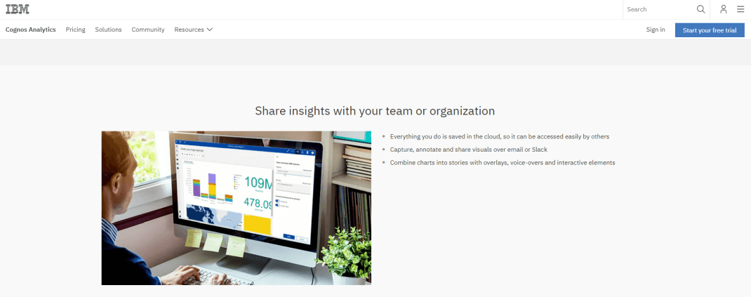
Making it easy to design reports, IBM Cognos Analytics is a data visualization tool with a wide range of data sources. They have relational databases, spreadsheets, text files, or Hadoop-based technologies. You can join them into a single data module, and start with your own dashboard creation. IBM Cognos Analytics provides numerous visualizations, including geospatial mapping and advanced analytics, with AI recommendations.
A simple lasso selection can select the parts of the map most interesting for your analysis. Copy the visualization and implement it into a new dashboard without any additional steps.
Their AI assistant communicates in plain English, which is a neat feature that enables you to ask questions directly to the system. The system then automatically recommends the visualization, but you can also choose your own.
Key Features of IBM Cognos Analytics:
- Join different data sources into one data module.
- Geospatial mapping.
- Select specific data points as a filter (‘Lasso’).
- AI-conversational assistant.
Shortcomings:
- Some users report performance issues for big data sets.
FusionCharts
A charting library, FusionCharts, lets you build web and mobile dashboards based on JavaScript. They cover over 90 charts and more than 1000 maps, enabling users to create powerful and custom dashboards.
The FusionCharts tool is a complicated tool aimed towards developers. No doubt, developers are quite happy with the possibility to integrate with popular libraries and languages such as React, Angular, Vue, jQuery, Java, .NET, or PHP.
Another neat feature is their data stories that use a series of linked visualizations to create a data-driven journalism approach. Helping you to create compelling narratives, these stories also come as templates. You only need to request the source code.
Users are satisfied with this plugin since it’s a simple solution to create charts directly for your website. You’ll want to get an experienced developer on your team to explore its possibilities.
Key Features of FusionCharts:
- JavaScript chart builder.
- Over 90 charts and 1000 maps.
- Integration with other libraries and languages.
- Templates for data stories.
Shortcomings:
- Their target group is developers so that you will need proper programming knowledge.
Zoho Analytics
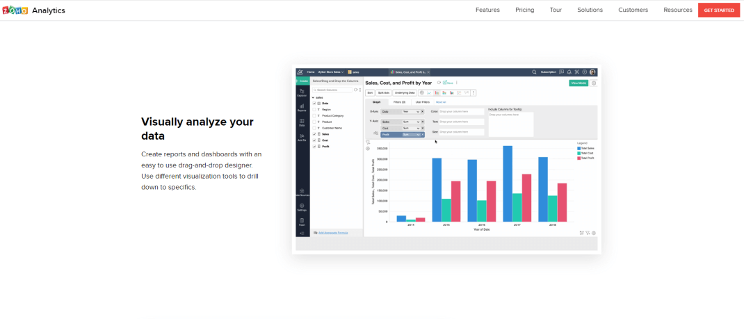
Generating visualizations and dashboards, Zoho Analytics enables companies and departments with tabular view components. These components use the help of various widgets and pivot tables.
Focused on data visualization experts and analysts, the solution offers in-depth features such as deep analytics powered by artificial intelligence assistant, Zia.
Similar to other mentioned tools, they also provide a drag and drop interface to create visualizations, and you can easily insert images, widgets, and web components in their layout.
An exciting feature is the geo-visualization, which enables you to interact with map charts based on regions, states, cities, and even latitudes and longitudes.
The spreadsheet-like interface for deep analytics enables users to apply pre-built functions, use their mathematical and statistical library, and create your own visualizations and dashboards.
Key Features of Zoho:
- Smart analytics with artificial intelligence.
- Comprehensive geo visualizations.
- Pre-built analytical functions.
- Mathematical and statistical library.
Shortcomings:
- You need to be data-savvy to utilize all software features fully.
Highcharts
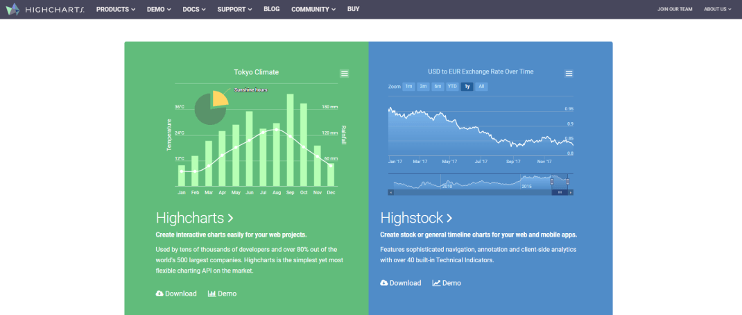
Another data via tools, Highcharts is focused on developers who want to set up charts into their websites or web applications. If you happen to need their charts for your NGO or school site, they even offer it for free.
The JavaScript charting engine supports line charts, area, column and bar, pie, scatter and bubble, combinations. Each of the dynamic charts, 3D, gauges, and much more, are both on iOS and Android systems.
Their pre-built templates are customizable, but, similarly to some other tools on our list, you will want the help of a developer to code and implement the desired visualization properly.
Their library works with any back-end database or stack while their API Wrappers for popular languages such as .NET, Python, Java, or R. These are available from Highcharts or their community.
Key Features of Highcharts:
- Multiple integration options for websites or web applications.
- Free for non-commercial use.
- Available also on iOS and Android systems.
- Open-source codes available.
Shortcomings:
- You will need help from an IT specialist to properly work with this chart library.
SAP Lumira
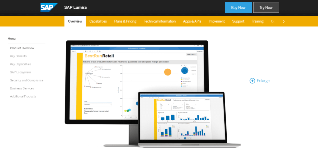
SAP Lumira lets you build visualizations through their newly updated and enhanced Lumira Designer, Discovery, and Server editions. You can apply scripting and integrations to develop rich reports.
You can combine data visualizations into a storyboard and generate a professional dashboard. SAP Lumira supports OLAP, so you also have additional technology to work with if you need advanced analysis.
The visualizations offer adaptive layout containers so you can easily choose how they will be presented on bigger or smaller screens. Utilize interactive data visualization apps so you can access your information from mobile, as well.
Offered both as a cloud and on-premise solution, SAP is robust software with numerous features that need some time to explore fully.
Key Features of SAP Lumira:
- SAP Lumira Designer, Discovery, and Server editions.
- Advanced charting abilities.
- Adaptive layout containers.
- Supports OLAP.
Shortcomings:
- Users report the need for proper training to make the most out of this software.
Tableau
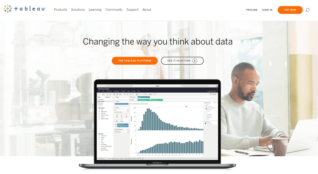
The Tableau platform combines many tools. You’ll receive data visualization that enables companies to visualize their analytics, prepare it, and share it online. You’ll then store the information on a cloud or on-premise.
Bought by Salesforce in June 2019, the company offers products such as Tableau Desktop, Prep, Online, and Tableau Server. To create a data visualization, you don’t need advanced programming skills. Gladly, they offer developer tools to integrate and customize API for your own organizational needs.
Similar to other tools, they also offer a drag and drop interface, numerous data connectors, and advanced analytics features. Choose trend analyses, regressions, and correlations.
Included in the offering are additional extensions for dashboards, which make the data visualization process much more robust and extensive. The gallery is still in the beta version but will enable you to upscale your via efforts.
Key Features of Tableau:
- Different data viz products for diverse needs.
- Automatic data modeling within the data preparation process.
- Additional gallery extensions.
- Developer tools.
Shortcomings:
- Training and coaching are needed to fully take advantage of all the different features, as the tool is not always intuitive to use.
Microsoft PowerBI
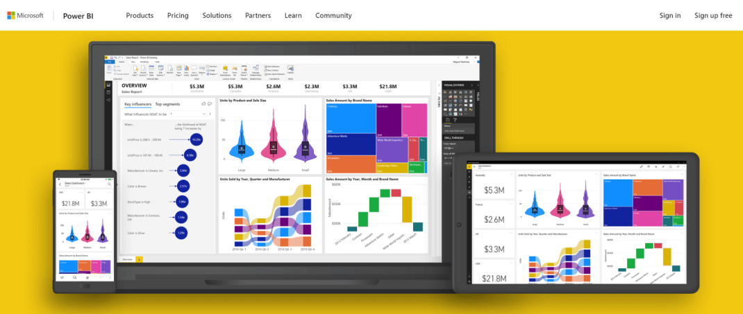
Our list of the best data visualization software for 2020 wouldn’t be complete without mentioning Microsoft PowerBI. This is a professional tool that is focused on business users, developers, and analysts.
The tool comes as part of the Microsoft Office 365 package; therefore, it’s easily integrated with other tools such as Microsoft Excel. They also offer several charts such as ribbon, treemaps, waterfall, R script visuals. There is an offer of several types of maps, funnel, gauge, etc.
Listings of visualizations get updated quickly, so new ones are added periodically. Similar to other tools, this tool is offered via cloud and on-premise. Your data efforts will always be available and accessible on-the-go.
An interesting feature is PowerApps is a library that enables you to build and extend apps through the Microsoft ecosystem, including PowerBI.
Key Features of Microsoft PowerBI:
- Easily integrates with other Microsoft tools.
- List of visualizations regularly updated.
- PowerApps library.
- Similar to other tools, also offered as SaaS and on-premise.
Shortcomings:
- Best mastered by savvy Excel users since the user interface is initially challenging to use.
Looker
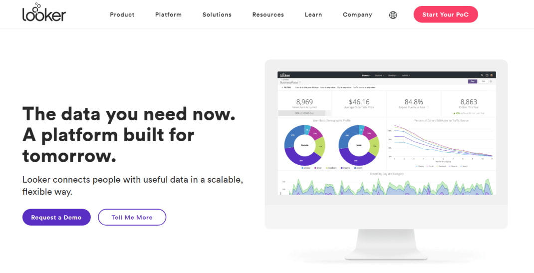
Focused on a “multi-cloud strategy,” Looker is also a data visualization tool. You can drill their visualizations into row-level detail, select one from their library or build your own.
Customization options include conditional formatting and “elegant details from trend lines.” Their visualization library consists of numerous data analytics blocks that can be customized and implemented into your dashboard.
You can also develop your visualization using JavaScript and save it to Looker, which is a neat feature if you like coding more than pre-built solutions.
Their charts consist of the funnel, maps, donut multiples, timeline, combined charts, and, as mentioned, customized ones. Looker also focuses on business users and data analysts. You’ll be able to perform visual discovery and custom analysis without in-depth technological knowledge.
Key Features of Looker:
- Drilling visualizations into row-level detail.
- Real-time data exploration of big data sets.
- Additional data visualization customization.
- Library of data blocks.
Shortcomings:
- It’s a powerful tool, but also fairly young software, founded in 2011 and bought by Google in June 2019 The tool is a relatively high-price solution (resources state on average between $3000-5000 per month).
InsightSquared
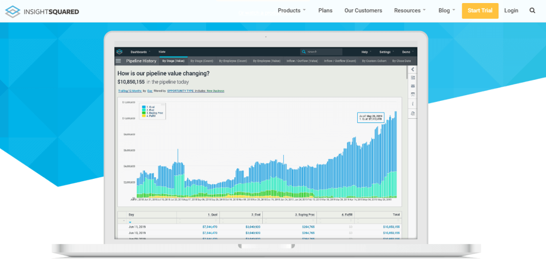
A revenue intelligence software, InsightSquared is used by professionals looking to streamline revenue operations. InsightSquared also facilitates AI in its process, mostly in the field of sales.
It also includes marketing analytics, pipeline management, forecasting, and SaaS reporting. Various departments can utilize its features, but sales operations are the main focus.
One of the top features they offer is Tiles, a sales report mosaic of visuals which connects to Salesforce and begins with pulling insights.
Key Features of InsightSquared:
- Focused on revenue operations.
- Includes analytics-focused primarily on sales.
- Pipeline management and forecasting.
- Tiles – a sales reporting mosaic.
Shortcomings:
- Since their focus is sales — other departments may lack some features.
Summary
Small, medium-sized business or large enterprise needs the proper data management and forecasting options to be able to survive in our competitive modern age. We have no choice but to enable ourselves to make accurate business decisions.
Professional, easy-to-use data visualization tools empower companies to extract actionable insights from their data. We can establish a data-driven business culture by making data analytics accessible for business users.
We hope this list will inspire you to make your own business decisions smarter and more informed by utilizing one of these tools in the year 2020.
Try Out Productivity Tools We Are Using
Monday.com | Best Productivity and Management Tool | on Monday.com | |
Calendar.com | Best Calendar and Scheduling Tool | on Calendar.com | |
Later.com | Best Social Media Scheduling Tool | on Later.com | |
Todoist.com | Best Time Management Tool | on Todoist.com | |
Toggl.com | Best Value Tool | on Toggl.com | |
Trello.com | Best Overall Tool | on Trello.com |