


The Apple Logo History, Colors, Font, and Meaning
Imagine this. You tap your phone, and there it is—a bite-sized marvel staring back, simplicity married to sophistication. The Apple logo. It’s iconic, but ever thought why?
That’s where we dive in. A journey through crisp curves and sleek lines painting a tale of a tech titan’s identity.
It’s not mere fruit; it’s a symbol etched in modern culture, a beacon of innovation and a whisper of minimalist design.
Here’s the scoop: by the end, you’ll unlock the saga behind that emblem.
We’ll unravel the logo evolution, decode the branding strategy, and, yes, even chat about that famous bite mark.
This isn’t just any story. It’s the chronicle of a logo that signifies more than most can imagine—the genesis, the genius of Steve Jobs and Rob Janoff, and the legal dances of Intellectual Property Law.
Prepare to be the one who knows, the one others turn to when they ask, “So, what’s up with the Apple brand identity?” Behold, the Apple logo unveiled.
The Meaning Behind the Apple Logo
![]()
A bite taken out of fruit — a portrayal both simple and profound. This symbol is entrenched in the fabric of modern culture, a token of innovation, simplicity, and curiosity. It is more than a formative design. It’s a visual chorus, singing the serenade of technology harmonized with user-centric pragmatism.
The aspect of brand recognition that the Apple logo brings to the table is unparalleled, consciously skirting the line between minimalism and knowledge. One might say the bite represents knowledge, a nod to the biblical narrative of Adam and Eve, or perhaps an analogy for the acquisition of knowledge—biting into the fruit of enlightenment. The Apple logo radiates a message: leap forth, dare to disrupt, and innovate relentlessly.
Interpreted as a tribute to Alan Turing, the father of modern computing, who—legend says—ended his life with a poisoned apple, it also stands as a silent sentinel to the company’s core values. It symbolizes the branding and logo development journey from garages to glass-fronted stores across the globe. Oh yes, it’s a visual haiku to the philosophy of aesthetics in functional form.
The History of the Apple Logo
![]()
Rewind to 1976; imagine a world before the dawn of this emblem. The tale begins with a different image altogether—Newton, an apple, an epiphany. One might call it the logo design evolution. This inception, however, was short-lived. Enter Rob Janoff, the artist tasked with the creation of something extraordinary, something lasting.
The first iteration of what we now know as the iconic Apple logo was born in 1977. Devoid of the complexity of its predecessor, it painted a rainbow-striped apple with a dexterous bite taken out of its side. Picturing the colors of the visual identity elements in horizontal stripes spoke volumes of Apple’s aim to humanize technology—to make it accessible, bold, and at the curve of revolution.
The rainbow hues were eventually replaced with more subdued tones over the years; the palette was simplified, refined, and enriched with deeper metaphor. Yet the shape endured, a testament to timeless design.
The Colors of the Apple Logo
![]()
The chromatic journey of the apple silhouette is a meandering road of intent and circumstance. From its inception as a rainbow to its monochromatic incarnation, color has been pivotal.
The original rainbow scheme of 1976 was emblematic of the brand’s fresh stance in the tech arena, an emblem of innovation—different pieces of technology working together, harmoniously. As the company grew and matured, so did the palette. Monochrome, metallic, and glass textures stepped in, delineating an evolution in sophistication—a company keeping pace with the relentless march of technology.
Yet, it’s not simply about the metal or the gloss; it’s about the adaptability of the brand. Whether on a sleek laptop or an animated advertisement, the hues chosen reflect the strategic intention to remain timeless yet timely.
The Font Used in the Apple Logo
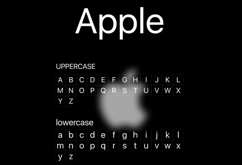
It whispers in the space it doesn’t occupy—the ethereal prowess of typography in the Apple logo. There is no font cradling the apple, no lettering to convey its identity, only a symbol so distinctive that the inclusion of a wordmark is extraneous.
Yet the typeface playing a significant role in the business identity design of Apple products is Myriad. First adopted in 2002, it serves as sans-serif speech for the brand across numerous products and marketing materials. Before Myriad came Garamond, nodding to classical elegance.
Typography and logo aesthetics meld, reducible neither to strokes nor serifs but as the visual voice of a brand that speaks volumes without uttering a word.
Influence on Graphic Design
The undeniable resonance that echoes in the chambers of air between a designer’s mind and their slate. It represents an understanding that to etch lines is to converse with culture. Other tech companies look to the apple for creative logo inspiration.
The Apple brand identity has emboldened an ethos of simplification in visual representation. A lesson: don the essential, forsake the extravagant. It has influenced designers to remember that sometimes, the boldest statement is the one unspoken—the negative space, the contrast, the balance.
Impact on Tech Industry Branding
Transcending mere logo, it has embedded itself into the psyche of the tech industry.
Here, among the algorithmic labyrinths, lies a marker for quality, user experience, and innovation. It serves as a beacon, one that beckons you to craft your own branding strategy, to leave an imprint on the dust of silicon and minds alike.
This symbol is not confined to a rectangle on a device. It wanders the halls of product branding theories, sits at the table where narratives are woven into campaigns, and sleeps in the dreams of startups aspiring to reach the zenith of their potential.
Legacy in Advertising
The logo, that herald of values and vision, has defined epochs in the marketing and advertising industry. Campaigns adorned with this icon are more than a procession of ads but a cavalcade of stories.
Its presence in media is a lore in and of itself—a mythos painted in minimalist strokes yet speaking the language of giants. The sagas painted across billboards and screens are a dance of challenges and triumphs, all housed under the humble roof of an apple, a silhouette that seduces the technological world with whispering promises of innovation.
FAQ On The Apple Logo
Who Designed the Apple Logo?
One guy, Rob Janoff, nailed it in ’77. Pure genius. He incorporated a bite for scale, hinting at computer bites and fruit. A logo was born that was as sleek as the tech it represented.
What Does the Apple Logo Symbolize?
Not just a tech emblem but a symbol of knowledge and innovation. That bite? It’s a nod to the fruit of knowledge, plus, believe it or not, differentiates it from a cherry. Genius, right?
Why Is the Apple Logo a Silhouette?
Here’s the thing: silhouette equals iconic design. It’s unmistakable, even from the corner of your eye. And that’s the gold standard in brand recognition—instantly identifiable, memorable. Less is more, and with Apple, that minimalism speaks volumes.
Has the Apple Logo Always Been the Same?
Nah, it kicked off rainbow-striped, a hat-tip to color displays. But things change, right? They went all monochrome on us, keeping up with their minimalist aesthetic. It’s about evolution, staying ahead, and crisp, clean brand imagery.
Is the Apple Logo One of the Most Recognized Logos?
You bet! Global recognition stats are through the roof—it’s a global branding heavyweight. Really, ask anyone, anywhere: that logo’s as familiar as morning coffee.
Why Does the Apple Logo Have a Bite Taken Out of It?
Beyond avoiding a cherry mix-up, the bite mark’s a geeky play on words—”byte,” get it? Tech humor, classic. Also, it gives the logo scale, making the shape clearly an apple, not just a circle.
What’s the Story Behind the Original Rainbow Apple Logo?
Ah, the rainbow logo. Introduced with the Apple II, it was a nod to its capability to display colors at a time when that was groundbreaking. Kind of a mix of technological prowess and hippie vibe from Jobs’ days.
Can Anyone Use the Apple Logo?
No can do. That’s intellectual property territory. They’ve got trademarked logos for a reason. Keep it off if it’s not official business, unless, of course, you fancy a legal tangle.
How Has the Apple Logo Affected Its Branding?
Massively. The logo tells you, without a word, Apple equals sleek, modern, premium. Branding strategy 101: a distinctive logo equals a bulletproof brand identity. It’s like the North Star for Apple enthusiasts.
Will the Apple Logo Ever Change Again?
Predicting that is tougher than winning the lottery. Branding’s about staying relevant, so who knows? They’ve tweaked it before for marketing and logos, keeping things fresh. They’ll change if they need to. But for now, it’s got the throne, and it ain’t moving.
Conclusion
So, here we are at the finish line, and what a ride. When you look at the Apple logo next, you’ll see more than just a graphic—it’s a bridge to a tech realm of innovation. What started as a quirky hint to computer bytes and knowledge evolved into a minimalist symbol of modern design.
- It’s a logo that saw the color spectrum of possibilities and settled on sheer simplicity.
- It’s an emblem reflecting the pioneering spirit and the boldness of Apple Inc..
Remember, behind every curve and color choice, there’s a story—a narrative of a brand that understands the power of visual identity. It’s about embracing change while staying true to the core of what makes a logo not just seen but felt.
In essence, this isn’t just an ending—it’s an invitation. Every time you spot that logo, recall the history, the strategy, and the symbol that leaped from computers to nest in the collective consciousness. Here’s to the logo that isn’t just recognized but revered.
If you liked this article about the Apple logo, you should check out this article about the new Patreon logo.
There are also similar articles discussing the Facebook logo, the Amazon logo, the Twitter logo, and the Netflix logo.
And let’s not forget about articles on the Microsoft logo, the Samsung logo, the Airbnb logo, and the IBM logo.
Bogdan Sandu, a seasoned designer with 15 years of diverse experience, has been designing websites since 2008.
Renowned for his expertise in logo design and visual branding, Bogdan has developed a multitude of logos for various clients.
His skills extend to creating posters, vector illustrations, business cards, and brochures. Additionally, Bogdan's UI kits were featured on marketplaces like Visual Hierarchy and UI8.
Latest posts by Bogdan Sandu (see all)
- Nature Color Palettes Inspired by the Outdoors - 25 April 2024
- The Epic Games Logo History, Colors, Font, And Meaning - 24 April 2024
- Spread Joy: Happy Color Palettes for Uplifting Designs - 24 April 2024