R × [googleVis]でinteractiveな図を描く
はいけい
shinyに図を載せるにあたって、クリックしたり動かしたりできる図を描こうと思いました.
かいけつさく
c3.jsでshinyにJavaScriptを組み合わせる方法を調べていたところ、
googleVis を使えば動的な図が描けるのを発見しました.
こちらのほうが敷居が低そうなので試してみます.
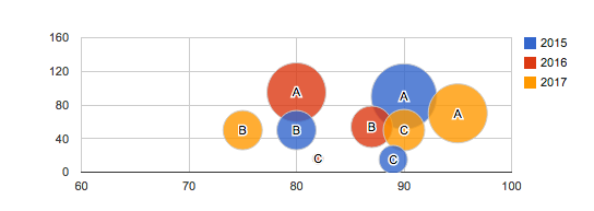
例 Bubble chart
Google Bubble Chart with R
data: データフレーム,X,Y,idvarの列が必要
idvar: IDに使う変数
xvar: x軸に表示する変数
yvar: y軸に表示する変数
colorvar : バブルの色分けに使われれる変数
sizevar: バブルの大きさ
values in this column are mapped to actual pixel values using the sizeAxis option.
app.R
library(googleVis)
library(shiny)

shinyApp(

# Server.R
server = server <- function(input, output) {

 #表示させるデータフレーム
  df_for_bubble <- read.csv(textConnection("
                              NAME,YEAR,VALUE,VALUE2,SIZE
                              A,2015,90,90,90
                              A,2016,80,95,80
                              A,2017,95,70,80
                              B,2015,80,50,50
                              B,2016,87,54,54
                              B,2017,75,50,50
                              C,2015,89,15,40
                              C,2016,82,16,30
                              C,2017,90,50,54 "))

  output$Bubble_Plot <- renderGvis({
    # 表示方法を書く
    Bubble <- gvisBubbleChart(df_for_bubble,
                              idvar="NAME",
                              xvar="VALUE",
                              yvar="VALUE2",
                              colorvar="YEAR",
                              sizevar="SIZE",
                              options=list(
                                hAxis='{minValue:60, maxValue:100}',
                                vAxis='{minValue:0,maxValue:120}')
                   )
    return(Bubble)
  })
},
# ui.R
ui = ui <- fluidPage(
  titlePanel("Bubble Chart"),
    mainPanel(
      htmlOutput("Bubble_Plot")
   )
  )

)
出力
カーソルを合わせるとpointの説明が出力されるバブルチャートが作成できました.
before
after
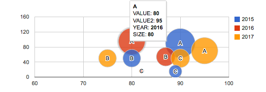
実際に動く様子は以下のアプリで確かめてみてください.
参考
First steps of using googleVis on shiny
c3.jsも平行してカバーしていきます