

As a general rule, I think most designers and frontend coders tend to spend more time thinking about columns in their web layouts than rows.
That’s not really surprising. As most devices are designed to scroll vertically, our page width is a more limited resource than our page height – so dividing up the horizontal space seems like a very natural place to start.
Vertical Baseline Rhythm
Vertical baseline rhythm – sometimes called the ‘vertical measure’ – is a grid of horizontal lines that you can use to hang your typography on. It’s not unlike the light-blue lines on the grade school workbook we all learned to write in.
Richard Rutter describes it like this:
Headings, subheads, block quotations, footnotes, illustrations, captions and other intrusions into the text create syncopations and variations against the base rhythm of regularly leaded lines. These variations can and should add life to the page, but the main text should also return after each variation precisely on beat and in phase.
The Elements of Typographic Style Applied to the Web
Often, even though we can’t see the actual underlying grid, we’re aware of it through a feeling of balance and harmony in the layout. We might not know why it feels ‘right’, but we know it does.
But does that mean every page element has to bow to the almighty grid?
No – not necessarily.
How does Wallpaper Mag… roll?
Wallpaper is a magazine that grew up in print. Their print layouts have always been neat, airy and classy with emphasis on attractive type and low ornamentation. Wallpaper’s online presence honors that approach.
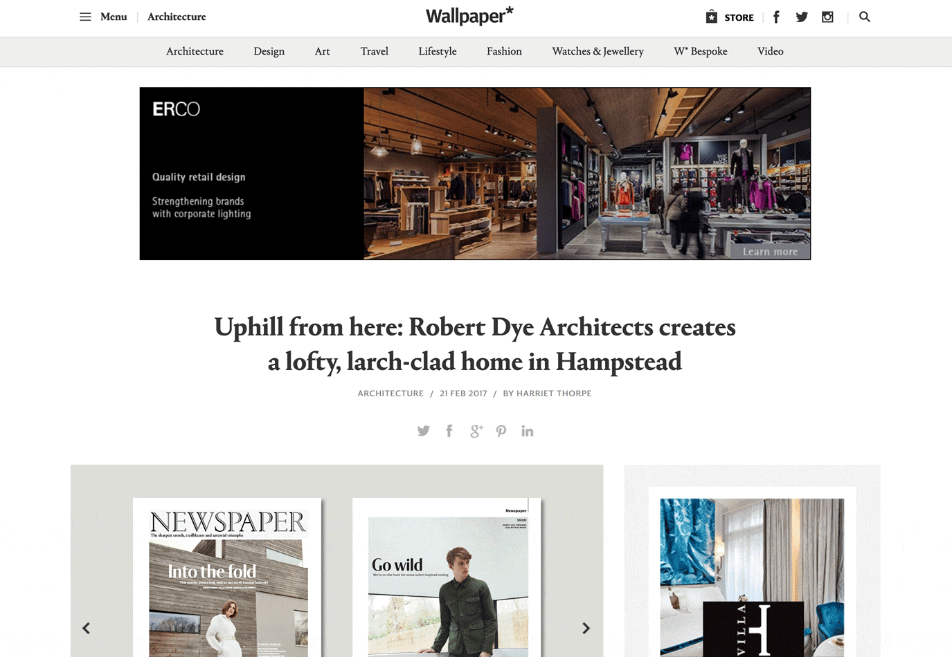
At first glance there isn’t an obvious grid – to my eye anyway.
But roll a 25px line-height grid across it and things becomes clearer. Elements aren’t always locked tightly to each line – though some are – but many float inside the lines provided.
Applying a Baseline Grid to any page
I’ve often found it useful to be able to apply a grid to a live webpage. It helps with the early stages of development and gives you consistent units to talk about with your dev team. It’s also a nice way to get some insight into why the layout of a site you like is working.
Here’s how I do it on Chrome, but it should work on most browsers.
1). Install Stylebot. and go to the page you want to add the grid to. Stylish will work fine too.
2). Click on the Stylish button and ‘Open Stylish’. Copy the CSS below and paste it into the empty Stylebot panel.
body {
    position: relative;
}
body:active:after {
    display: none;
}
body:after {
    background: linear-gradient(to bottom, rgba(200,225,255,0.6) 1px, transparent 1px);
    background-size: 17px 25px;
    bottom: 0;
    margin-top: 0px;
    content: '';
    display: block;
    height: auto;
    left: 0;
    pointer-events: none;
    position: absolute;
    right: 0;
    top: 0;
    width: auto;
    z-index: 9999;
}
You should immediately see light horizontal lines overlaying your page (see image).
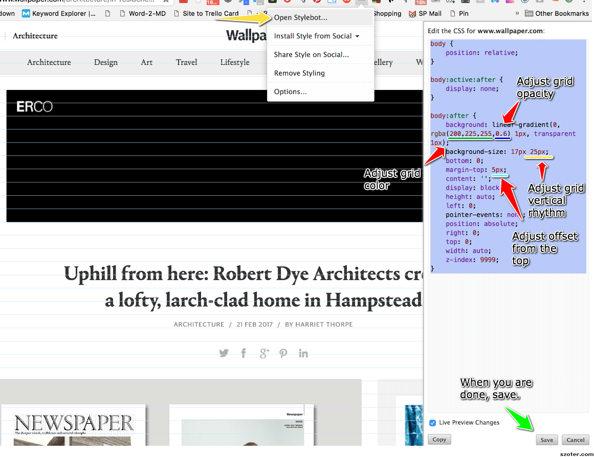
3). You’ll probably want to adjust the grid. Change the second number in background-size to change the line-height of your grid.
...
background-size: 17px 25px;
...
Change the color and opacity in the grid by editing the RGBA color in `background’.
...
background: linear-gradient(to bottom, rgba(200,225,255,0.6) 1px, transparent 1px);
...
4). When you’re happy with it, hit SAVE, and your grid will be applied to any page you visit under that domain. Click ‘Cancel’ and then ‘X’ to close the StyleBot editor.
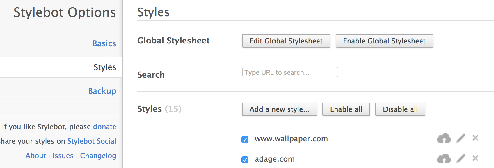
5). You can deactivate your grid (or any other CSS you’ve applied to the page) by clicking on the StyleBot button, selecting ‘Options’ and then ‘Styles’. You can switch your grid on and off any time you like.
Here’s quick screen grab showing it. https://share.viewedit.com/wrPnnTvyMguMuDKD4TnXCo
Vertical Baseline Rhythm is not a religion
Vertical Baselines are a handy tool but they shouldn’t take over your design. There was a time where I spent too much sweat trying to bend every page element to obey my mighty grid rules. I was arm-wrestling typographic percentages and margins and ‘hitting the grid’ became a goal in itself, rather than just a tool to help me design better. That’s not fun or very useful.
It’s better to look at vertical baselines like a strong bass drum in a band. A steady beat helps mark out the space for the rest of the band to play in. But if everyone is too bang on the beat, you probably have yourself a fairly boring marching band (no offense to marching bands).

Set up a nice beat that everyone can feel, but don’t be afraid of little flourishes that might land slightly off the beat. They can add energy and flavor to a composition (and a song for that matter).
Personally, I like to establish a strong grid and use it. If there is whitespace between headings and paragraphs, it might as well be 1, 2, or 3 whole ‘vertical units’ – rather than 1.3 or 2.75 units. Your feature image might as well be exactly 12 units tall rather than 12.3 units or 11.8, as now the bottom edge of the image is more likely to line up nicely with any text flowing alongside it.
But on the other hand, if, for instance, the caption on those images looks too spacey when it is spread over 25px line-heights, that’s fine. Just make it look good.
The grid is your trusted layout advisor – not your master.
 Alex Walker
Alex has been doing cruel and unusual things to CSS since 2001. He is the lead front-end design and dev for SitePoint and one-time SitePoint's Design and UX editor with over 150+ newsletter written. Co-author of The Principles of Beautiful Web Design. Now Alex is involved in the planning, development, production, and marketing of a huge range of printed and online products and references. He has designed over 60+ of SitePoint's book covers.