How to Make Any Responsive WordPress Site Mobile-First
Responsive websites and responsive themes are more than a passing fashion. With more and more people using a mobile device to access the internet, responsiveness is now an essential feature of any good website or WordPress theme.
If you check out the WordPress theme repository, you’ll find that the majority or recent themes are responsive. And our WPMU DEV themes are responsive too, meaning they look and work great on any device.
But responsive design has evolved in the seven (yes seven!) years since it was first developed by Ethan Marcotte. Now designing for a variety of screen sizes is about much more than identifying some breakpoints for popular devices and adding them to your stylesheet.
It’s about making your design work for any screen size, so that your breakpoints are based on your layout and not on anticipated screen size. It’s about performance, and ensuring your site is fast on all devices and all connections. And, importantly, it’s about content too – developing content that works on any device and designing around that content, so that the user experience is as good as possible when consuming that content.

My favourite method for addressing these challenges is to adopt a mobile first approach, which turns traditional web design on its head. Instead of designing your content and layout for a large screen and then adjusting it to fit smaller screens, you design for small screens first, and then adjust for larger screens. This gives you a number of advantages when it comes to content planning, design and performance, as well as making coding more efficient.
In this post, I’ll outline some of the benefits of the mobile first approach and explain what it consists of in more detail. Then I’ll show you how to go about converting your responsive theme to a mobile first one. I’ll identify the main layout elements in your theme and what you’ll need to do with them to make your theme mobile first.
So let’s get started with an outline of just what the mobile first approach is.
What is Mobile First?
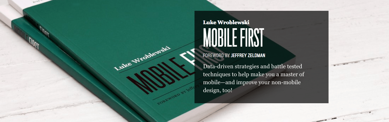
Mobile first is an approach to web design and development developed by Luke Wroblewski in his book Mobile First. It’s about two main things:
- Rethinking the way you approach web design and development to consider mobile devices first.
- Writing media queries that work from small screens upwards, not large screens downwards as in straightforward responsive design.
So what does this mean in terms of the way you work? Well, rethinking your web design so it’s mobile first involves a few things:
- Focusing on content and interactions not on details, images and elements that make your site look pretty and fill space.
- Ditching on-screen elements that are just there because there’s space for them, not because they have a purpose.
- Designing for user experience – so the design makes it easier for people to consume content rather than just being about looking good.
- Considering the necessities in terms of content – now that you have a small screen to work with, what do you actually need to put on it?
- Structuring your content so it’s easy to interact with on a small screen.
- Being efficient – both the site and the code.
I’m not saying this means your site or theme shouldn’t look good – having an attractive, modern design is important for UX and for creating an impression. But I am saying that mobile first design isn’t just about looks – it’s about interactions, user interactions and efficient use of space too.
Mobile first development also has implications for the way you build themes. The main considerations are:
- Styling your layout for small screens, assuming content blocks will be full width by default, and then adding media queries targeting larger screens so that the layout adjusts as the screen gets bigger.
- Sending smaller images to a device by default and replacing these with larger images on larger screens rather than the other way around (WordPress does this for you automatically, yay!).
- Sending visual elements that are nice to have but not essential to larger screens only – I often do this with sliders, for example.
- Doing your development and testing on a small screen first and then working up to a larger screen, which may be contrary to what you’re familiar with and indeed most comfortable with.
At first, it’s a bit of a leap, as you have to change the way you think and the way you code. But once you get used to it you’ll find that you don’t have to write so much code and that you create more effective, user-focused designs which are quicker and easier to pull together. And that your themes perform better. What’s not to like?
Why Mobile First Makes Your Code more Efficient
As far as coding is concerned there’s one big benefit to mobile first:
You’ll write less code.
That’s got to be a bonus. But why is that?
Well, think about a responsive theme, with a desktop layout a bit like this graphic:
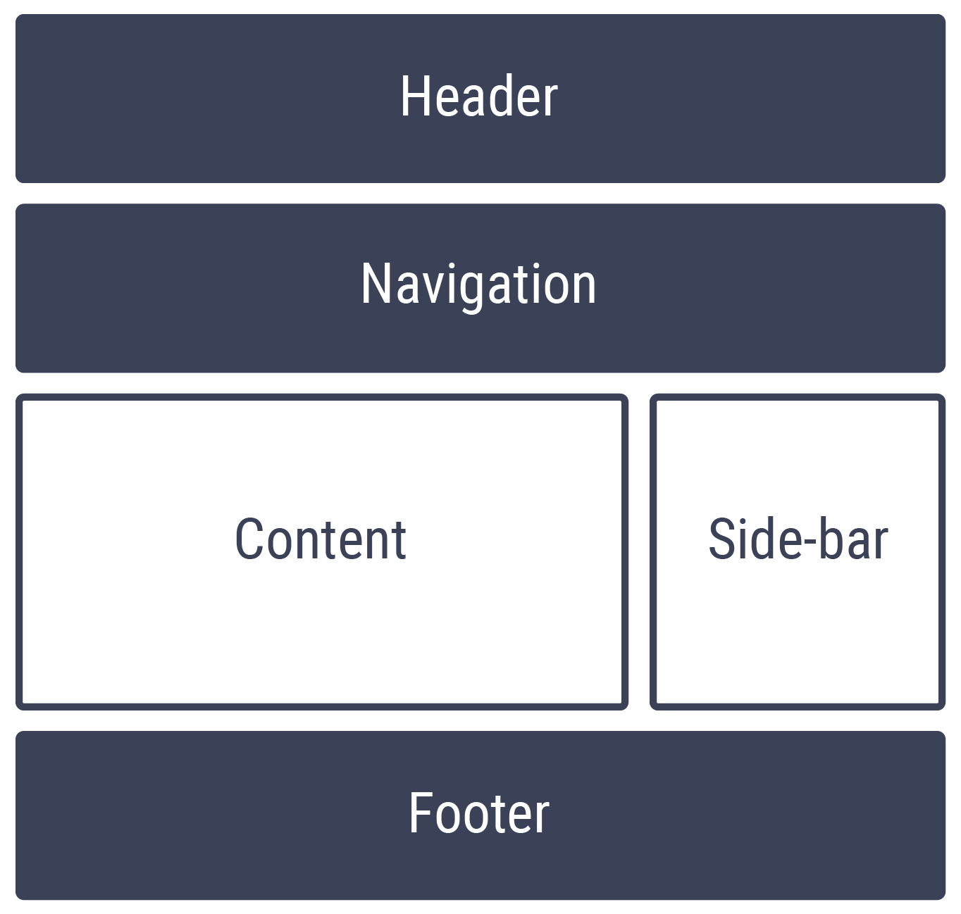
I’ve highlighted the elements that have 100% width in blue and the others in white. On a small screen the layout will probably adjust to something like this:

So the content and sidebar are both getting 100% width.

FREE EBOOK
Your step-by-step roadmap to a profitable web dev business. From landing more clients to scaling like crazy.

FREE EBOOK
Plan, build, and launch your next WP site without a hitch. Our checklist makes the process easy and repeatable.
Now, in order to achieve that you have to write two blocks of code:
- The code defining the layout for the content and sidebar in the larger screen, including floats.
- A media query adjusting this for smaller screens – setting the width to 100% and removing floats.
Now think about a mobile first approach. You’re starting with a smaller screen, where the width of each element will be 100% by default and it won’t be floated. So you don’t have to write any code defining the width of your content and sidebar as 100% or removing floats. This means that for the layout of those two elements you’ll have to write just much less code:
- A small amount of styling for small screens.
- A media query adding width and floats for larger screens.
Now, of course, it isn’t quite as simple as that. You’ll have other styling to factor in, such as margins, padding, font sizes and more. But when it comes to the simple layout styling, using a mobile first approach means writing half as much code. And as you’ll see shortly, this also applies to wider elements on the page (the header, navigation and footer for example) which might have max-width applied to them.
So let’s explore how to do it in more detail.
How to Make Your Theme Mobile First
The best way to approach mobile first design and development is from a blank slate. With a new project, you’ll get the full benefits of mobile first, including the fresh approach to design as well as the coding benefits.
But sometimes you’ll have a responsive theme that you want to update and convert to mobile first. How do you go about doing that?
Let’s take an imaginary theme and consider the layout styling it might have already. Here’s our desktop layout again:
The main elements of this layout will be something like this:
headernav.mainsection.mainsection.contentaside.sidebar
footer
The layout styling for this is likely to be something like this:
As the theme is responsive, you’ll also need some media queries for the smaller screen version. There could be a few of these but let’s focus on the one for the smallest screens. This is likely to be something like:
You might choose to structure your CSS differently (or use a pre-processor) but essentially this is what you’ll have. Two blocks of code: one for desktop and one for mobile.
Now let’s take a look at how you convert this to a mobile first layout. Firstly, delete both blocks of code.
Now at the top of your spreadsheet, you can define layout for small screen sizes:
You’ll notice that it’s shorter than the original styling for small screens. This is because you don’t have to undo anything you’ve already created for larger screens.
Now create the media query, this time using min-width instead of max-width:
Look familiar? It should: this is the same styling that you used as the default in your responsive stylesheet. So there isn’t any gain here in terms of the amount of code but there is one in terms of performance: devices with smaller screens will ignore this instead of having to work through it and then override it with elements you added in your responsive media query. Which will give a small performance improvement on mobile devices.
You may have noticed that the max-width value is much higher for the full width elements than the min-width value for the media query, making this line of code redundant for screens sizes of less than 1000px wide. Here’s a challenge for you: try removing that part of the code and adding it to a second media query that targets larger screens.
So that’s how you convert your responsive layout to a mobile first one. There are two steps:
- Write the default styling for small screens, which takes a very small amount of code.
- Add in a media query using
min-widthinstead ofmax-widthand copy the default styling from your responsive theme to this.
Chances are you’ll have to make some tweaks to get it working perfectly with your layout, and you’ll need to make adjustments for other elements such as navigation, but this is essentially how you do it.
Switching to Mobile First Is Easier Than You Think
The thought of converting your responsive themes to mobile first sounds like a real headache. You’ll have to completely rewrite your stylesheets and start all over again, right?
Wrong. Unless you’re taking advantage of the opportunity to rethink your design as well as your code, then it’s pretty straightforward. If all you want to do is change the same design and layout to a mobile first approach, then you just switch your layout styling around and take out some code you don’t need.
Try this on one of your existing responsive themes now, and it will stand you in good stead for developing mobile first themes from scratch in the future.
Tags:
Rachel McCollin Rachel is a freelance web designer and writer specializing in mobile and responsive WordPress development. She's the author of four WordPress books, including WordPress Pushing the Limits, published by Wiley.